📉 Reducing Out-of-Pocket Costs
40% of adults say they have delayed needed care due to the cost. CareHive’s Site of Care solution improves access to high-value providers while reducing the cost of care.
Overview
My Role
Product Designer
Duration
8 Weeks
Year
2024
The Team
Product Manager, Software Engineer, Data Scientist, Content Designer, Clinical Ops
Deliverables
- Journey MapService BlueprintAffinity DiagramWireframesPrototypeHi-fidelity Mockups
Tech & Tools
- UX DesignUser ResearchPrototypingNext.jsSupabaseChakra UIHealthTech
To protect client confidentiality and intellectual property, some visuals and data in this case study have been modified or obscured. The work shown represents a collaborative team effort.
Key Result
Private
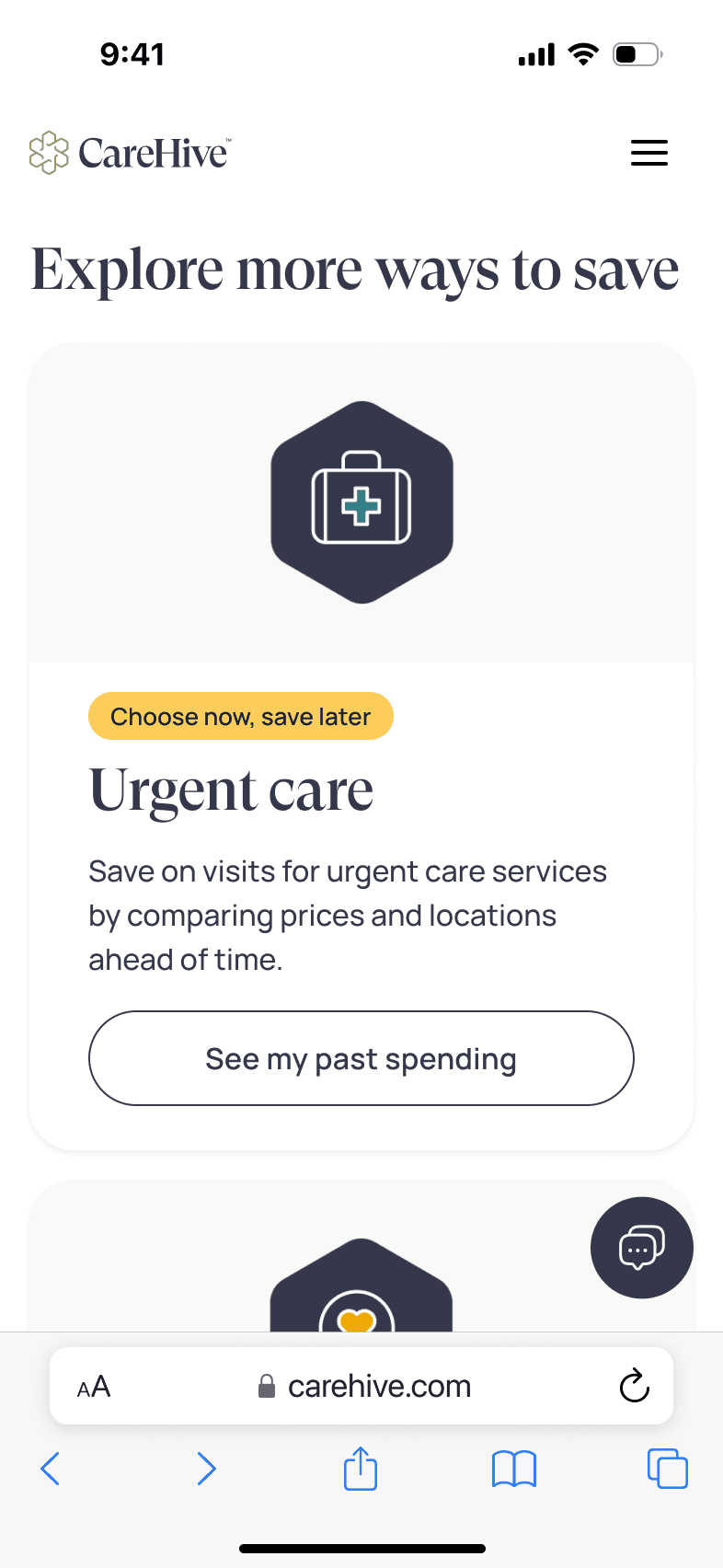
Scaling From One Service to Many
Our MVP originally guided users through a single service flow, but as CareHive grew, we needed to introduce multiple service offerings without adding complexity. The risk was overwhelming users with too many choices or forcing them into cumbersome navigation, threatening both engagement and conversion.
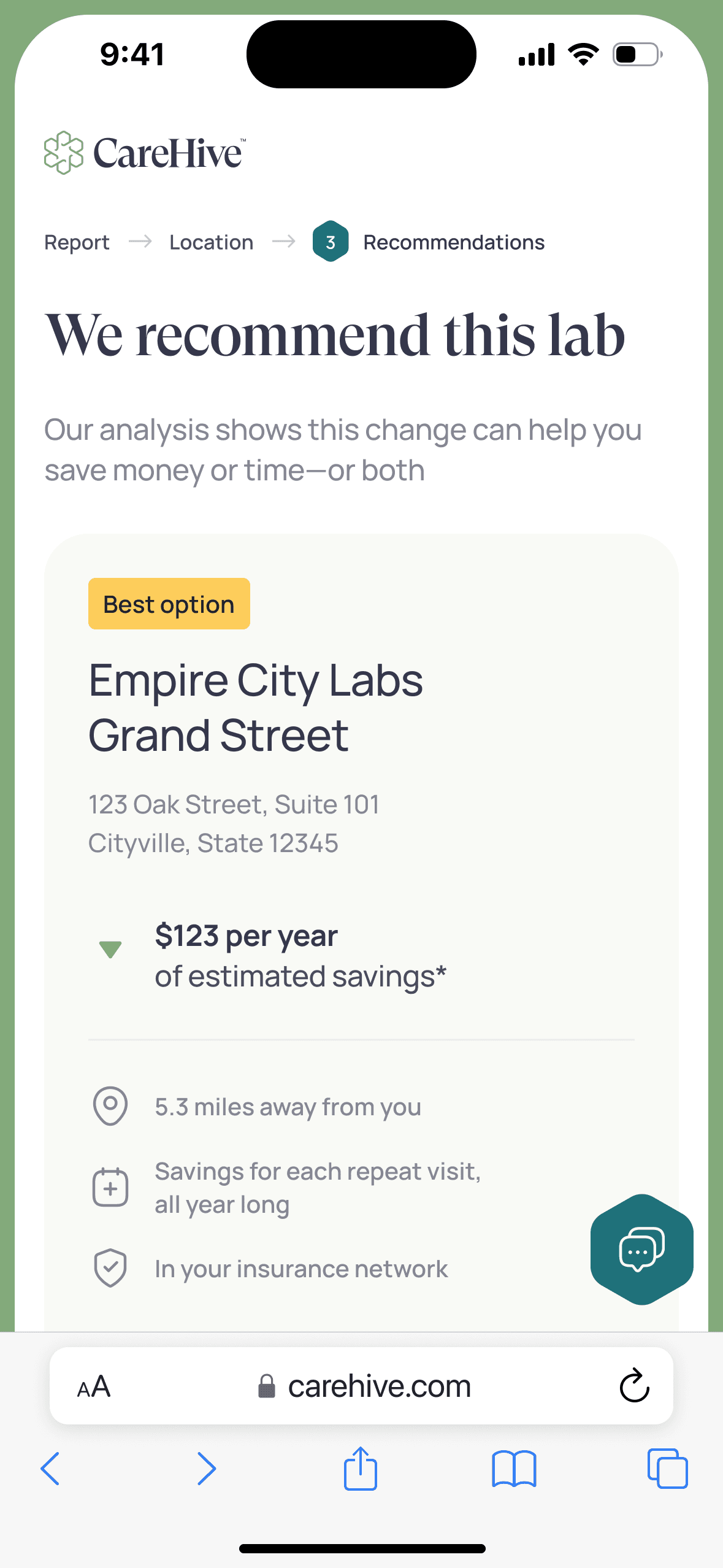
Introducing a Guided Welcome Experience
I led a series of cross-functional and company-wide design workshops to align stakeholders around a shared vision. We crafted a dedicated Welcome page that presents each service succinctly, then funnels users into modular, context-sensitive flows. Interactive prototypes were validated in rapid feedback sessions to ensure clarity and ease of use before development.
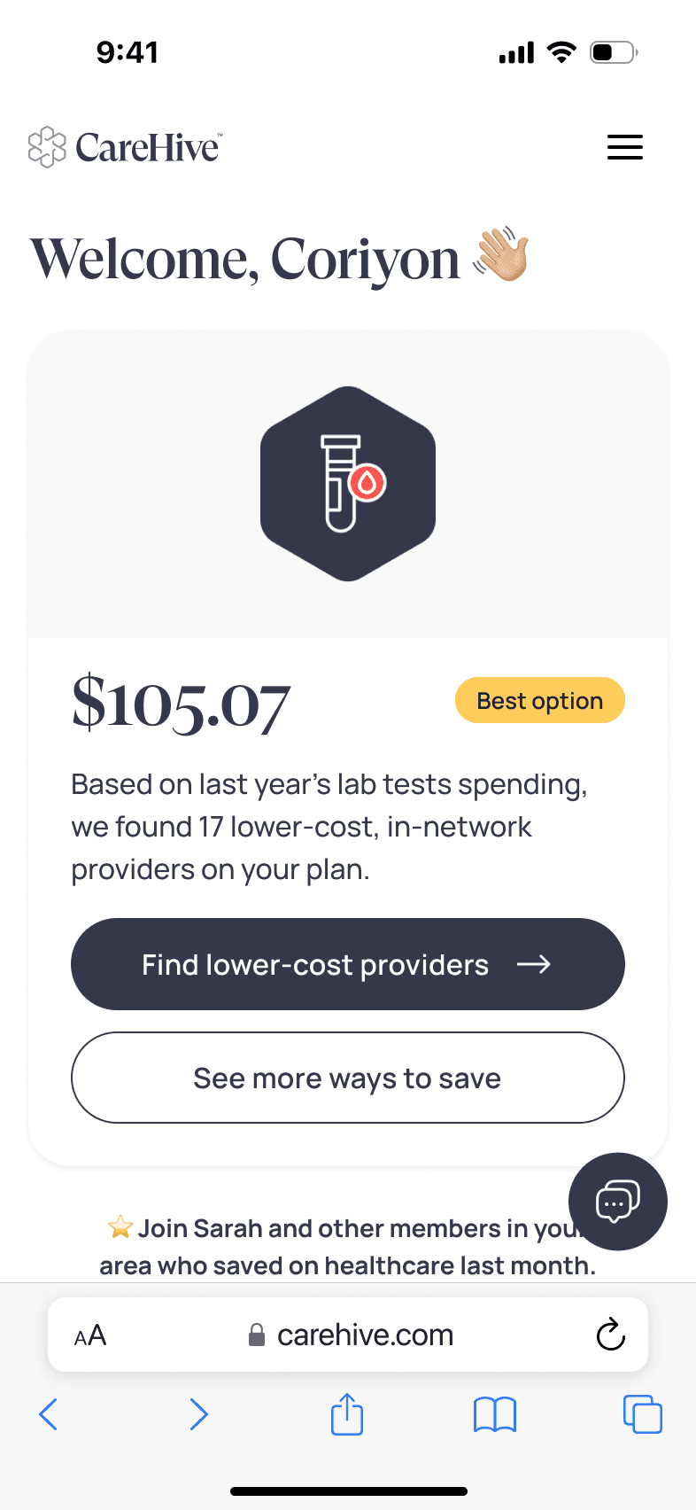
A More Robust Yet Simplified Platform
While precise metrics remain internal, post-launch we saw a clear uptick in sales demo bookings—proof that users felt more confident exploring and engaging with our expanded service catalog.
Key Problems Addressed
Low signups
High Impact AreaPeople come to your site but never sign up or get started.
Poor engagement
Session time < 30sPeople visit your site briefly then leave without taking action.
High user churn or low retention
High Impact AreaA significant percentage of users stop using the product or service after a short period, failing to become long-term, active customers.
Complex interfaces
High Impact AreaPeople struggle to find what they need and get frustrated.
Inconsistent UI across platforms
High Impact AreaThe user interface looks and behaves differently across various devices (desktop, mobile, tablet) or platforms (web, iOS, Android), leading to a disjointed user experience.
Key Solutions Included
Get more patients booked faster
Proven ROITurn first-time visitors into repeat bookings with a smooth, 4-step signup flow.
Discover how to engage patients
Targeted user insightsDiscover your portal’s top UX blockers—and get a clear action plan to boost bookings.
Discover why patients get stuck
+15% conversion liftWe’ll show you where patients struggle in your portal. Then you’ll get a clear plan to fix it and boost bookings.